The physio-flow website was a perfect example of the way our 2014 FREE website offer was designed to help small businesses get of the ground . . .
. . . and then build to the next level once they had established some clients and generated some income to be able to pay for a better site.
Fiona, lives locally to our designer Linda, at Wild Ideas, and had originally spoken to Linda about possible flyers to promote her planned business venture of local Pilates classes.
Fiona had a logo of sorts, but it was a clip art type image that she had purchased on-line, and it was not guaranteed to be 100% bespoke.
Linda suggested that if she paid for it to be enhanced, that would qualify her for the 2014 FREE website offer, so Fiona went ahead.
The 2014 offer (as it was) has expired, but we can still give you a FREE website with some design work from Linda.
 Linda did some design work to adapt the simple image that Fiona was using, and create a professional unique logo for her brand.
Fiona then provided some images, and chose one main one for her FREE website. She also wrote some copy about her business and created a simple table showing class times and locations and this was added to her simple one page free site, to get her started.
Having even the simplest of websites, is obviously much better than nothing at all, and the benefits of having this in preference to a wordpress.com or moonfruit.com etc etc, is that you get your own unique professional domain name.
With that unique professional domain name you also get an email address, a unique professional email address that is yours, (small fee payable in future years for hosting and domain registration).
And then like Fiona, when you have got your business a bit more established, with some paying customers your website is already there, no scrabbling at the last minute to bodge something up.
You can add to it whenever you like, change bits and update bits, or go for the full professionally designed upgrade.
Fiona, was fortunate to have a small sum of money that she had allocated to help set up her business, so once that was available to her she got back in touch with Linda.
This time, she proceeded with the design of some flyers to distribute door to door and in local publications, to drum up customers for her new classes.
At this point Linda also helped Fiona with copywriting to establish a strapline to add to her logo design, and a headline to represent her business.
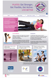
Linda then proceeded with the website design, in the same theme as the flyers. It is important to replicate your branding across all your marketing to establish yourself in the market place.
You need to look the same so people recognise the familiarity of YOU wherever they come across your business.
It can help to keep Linda’s design fee down if you already have another product designed by her, as she can utilise that existing design to translate to your website. As Linda had already selected the colours, font and images for the flyer, Fiona’s upgraded Pilates website uses these elements.
Linda always works closely with clients making sure they are happy with the design prior to passing an approved version to us at DBN.
And to keep within budget, Linda also just produced quick roughs of the layout for us at DBN, and left us to produce the slick final versions during coding.
 Fionas supplied additional detailed text and information was distributed over the typical 4 website pages . . .
. . . home page, is a general introduction, a headline – to quickly tell the visitor what the site is about, an attractive image to make them want to read more . . .
. . . about pilates, the obvious really, detailed information about the business or product
much more than you can get on a flyer. . . or might be about you
. . . contact page / about Fiona, depending on your business this might normally just be a contact form, but as Fionas about page is about her product (pilates), then Linda chose to include the information about Fiona in with the contact page.
. . . class information, This is displayed in an easy to read set of tables, together with a changing testimonial, to tell visitors what a “super Pilates teacher” Fiona is, and some prices.
Our normal practice is to add “responsive” functionality, which enables the content and text to re-flow and change size or position to fit on whatever size screen it is being viewed upon.
This is very important these days as more people are viewing websites on smartphones and tablets and from this month Google will be marking down a non mobile-friendly site.
So Fionas site is desktop, laptop, tablet and phone friendly, providing a great experience for all her visitors.
This is a clean and sleek site, but the bold branding colours give it a vitality and presence that welcomes the visitor in, and the punchy headline and large images, immediately tell the visitor what it is all about.
This is one of Linda’s design favourites, and ours too – a great example of a superb website at an affordable price.


