
www.acquaheat.co.uk
John telephoned Linda from Wild Ideas one evening after seeing Wild Ideas advert.
Linda had a good conversation with him reassuring him on how she works and arranged a meeting at his home the following week.
![]() John had some strong ideas and his wife Janice had done lots of her own drawings, but after already spending so much time they had realised that they needed a professional designer to get their project done well and completed quickly.
John had some strong ideas and his wife Janice had done lots of her own drawings, but after already spending so much time they had realised that they needed a professional designer to get their project done well and completed quickly.
Linda spent a couple of hours with them really getting to grips with what they wanted for their branding, and answering their questions on how how her design process worked.
The main execution for their new branding was to go on John’s new van, so the design had to work well against the black paintwork.
John already had a contact who could produce the graphics for the van, and he gave Linda the details so she could liaise with them, making sure that the correct specifications were adhered to for producing the artwork.
The designs and drawings Janice had produced were much better than she realised and a great source of inspiration to Linda. It is important that as much of the clients ideas can be incorporated as possible to maintain an originality to them.
 They also wanted to get a website, and were keen to know what was involved and what we could do for them.
Linda explained as much as she could, but then encouraged them to speak to the expert, Dennis at DBN who codes up and hosts the websites.
John quickly approved Wild Ideas quotation and signed off the paperwork so Linda could start working.
Linda focused on the logo design, initially suggesting some different fonts as well as doing 2 to 3 initial ideas based around what she had agreed with John and Janice.
Linda emailed her initial ideas and font suggestions and John and Janice chose the one they wanted to progress to a finished stage.
They also made some suggestions, and requests, that Linda could incorporate into the finished artwork.
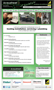
John’s business ethos is to help people get as much green energy as possible, so he wanted to incorporate the green feel into the design.
He had not wanted to use an obvious flame design, but with clever interpretation Linda incorporated very obvious plumbing and heating icons within a green line, creating a unique logo that they loved.
John wanted the company name to look like chrome, so Linda experimented with grey tints and effects to achieve the best result on the logo that they would use for printed items.
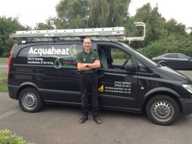 The vehicle livery was perfect to execute this though, as the vehicle graphics company used a silver metallic vinyl that was perfect for this against the black paintwork.
The green line on the logo was enhanced with a 3D effect that was not be achievable with standard cut vinyl lettering, but John decided it was worth the extra cost to produce this as a special print for his van to maintain the effect.
John and Janice’s budget would not stretch for Linda to do the complete design on the website, so Dennis at DBN produced the site under Janice’s instruction.
Janice is an Art teacher so has a good amount of creativity and an eye for design herself which made this easier for her.
Linda advised Dennis on some design and content elements, and consulted on the look and feel of the site as Dennis progressed with the coding, designing any individual elements that Dennis needed, to assist him.
John and Janice were very pleased with the result, and have since had further design work for a flyer for their business.
“DBN Web Design offer a custom made service. We received prompt service which was professional & friendly.”
Janice Garde – Lichfield


